Pixcode logo

Brewtime Store

Visit Link

Brew Time was founded on a common passion for coffee and an interest in how tiny tools may make a huge difference. What began as a hobby among friends, experimenting with 3D printers and brewing methods, quickly evolved into a quest to manufacture high-quality, precision-engineered coffee accessories.

The brand discovered an unmet need for tools that are not only useful but also visually appealing. With that, BrewTime was born, offering a new perspective on the equipment coffee enthusiasts use daily.

The project began with custom artwork for a coffee journal cover, along with a thank-you card that was bundled with every journal. From there, the initial website was built on Wix. Later, the product box for the flagship WDT tool was redesigned, a tool that works across multiple espresso basket sizes. Finally, the website was redesigned on Wix Studio to better reflect the brand's evolving identity.

Problem

The initial problem was not just to have a website, but to create something that :

Communicated the brand's story and passion for home brewing

Made it easy for baristas in cafés to use BrewTime products

Supported a growing range of products beyond just one item

Could scale as the product line expanded from journals to trays to WDT tools

The brand also needed to feel approachable and coffee-focused, not clinical or over-designed. It had to balance warmth (home brewing passion) with precision (barista-level tools).

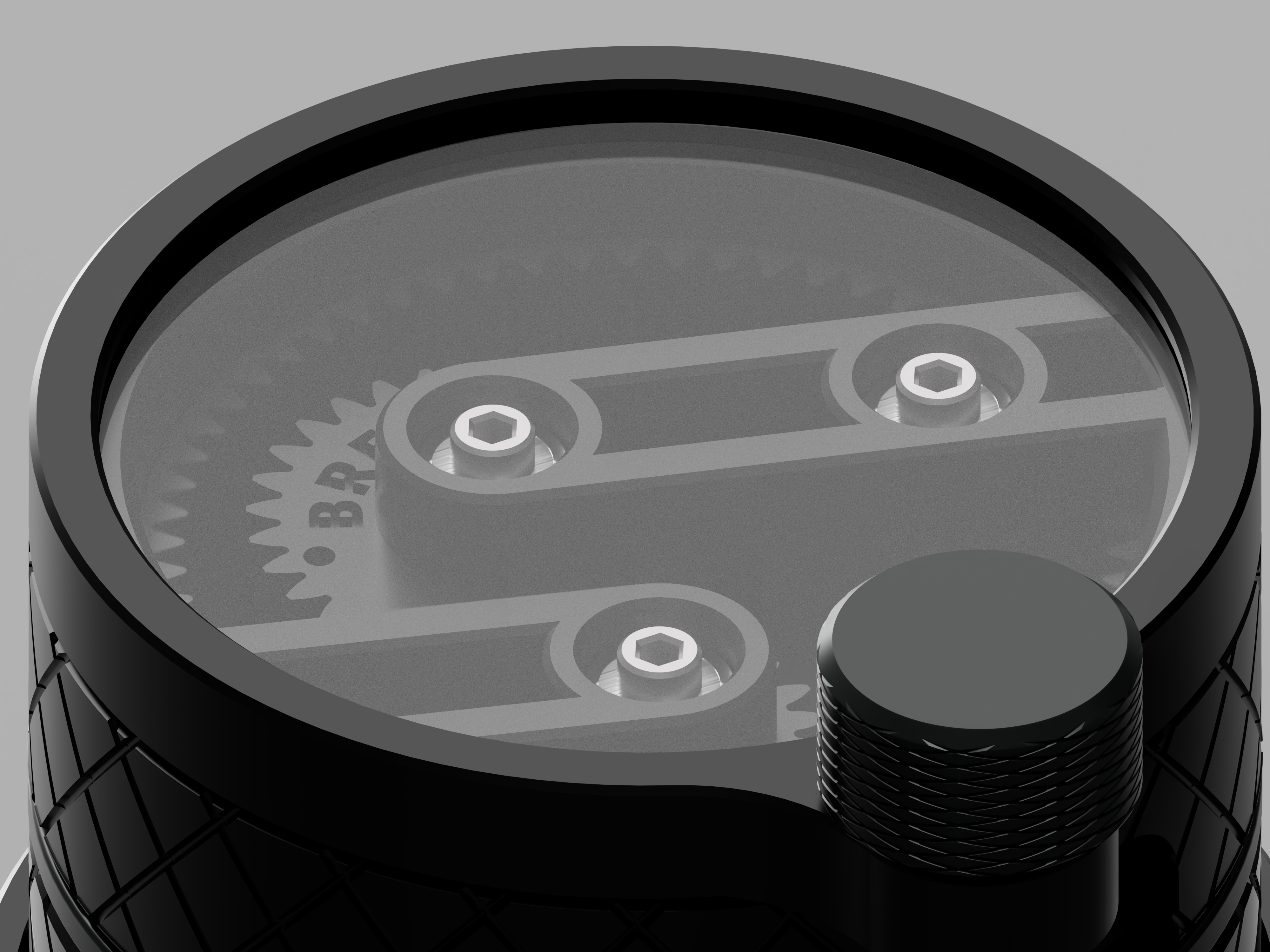
High Quality Render of WDT

Context

At the start, Brew Time was a passion project for home brewers. The first product was a set of coffee journals, where users write down their brewing recipes for espresso, pour-over, and other methods.

The journals got early interest and some initial orders, which made it clear that the brand had potential but still lacked a scalable identity.

As demand grew, the product line expanded:

First, multiple journal types and iterations

Then, dosing trays. Finally, the flagship WDT tool is designed for a variety of espresso baskets

With more products, the original website became limited. The brand needed a redesigned site that could support a clearer product story and a more structured ordering flow.

Approach

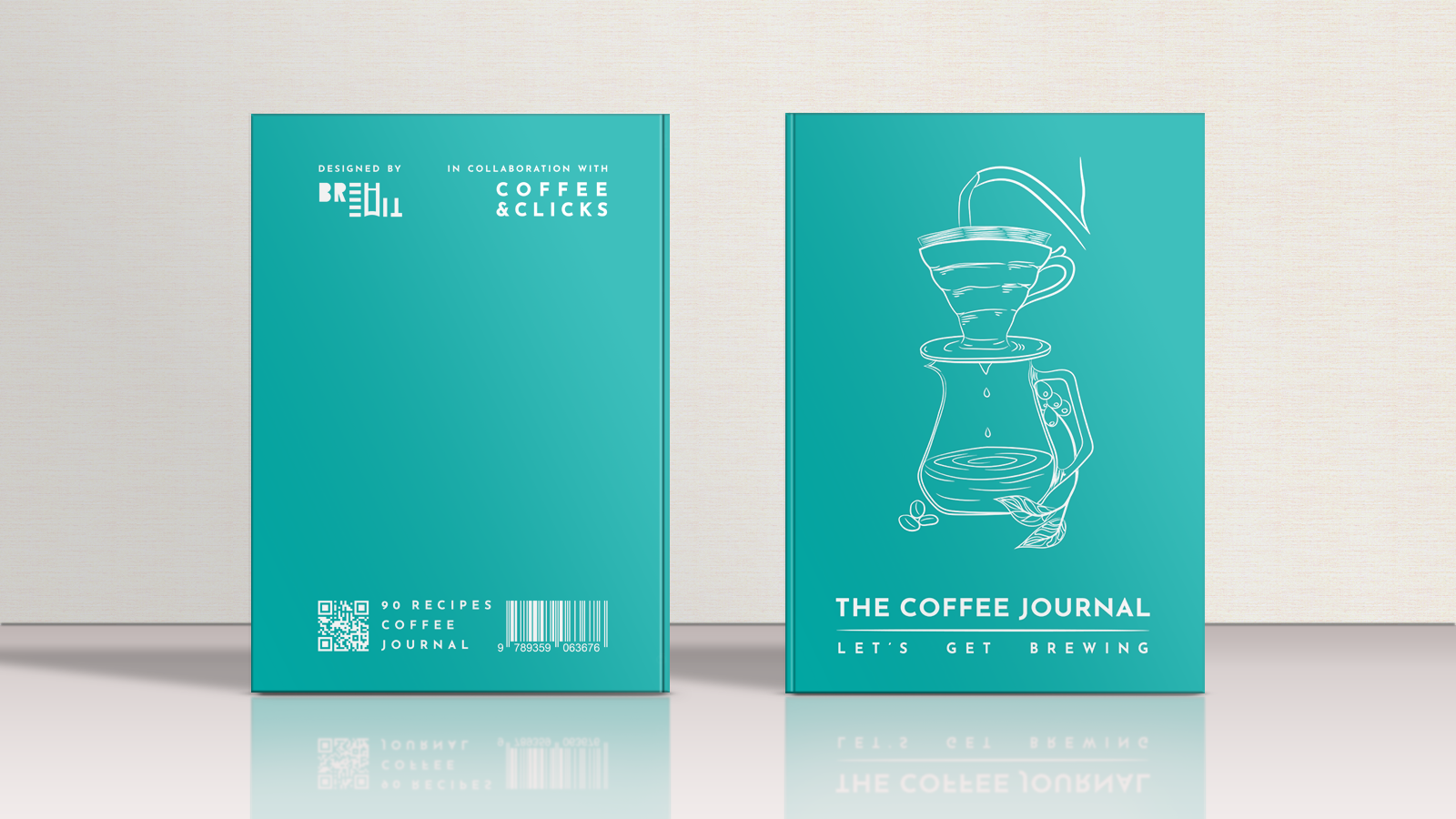
Custom Journal ArtWork, Thank You card & Initial Website

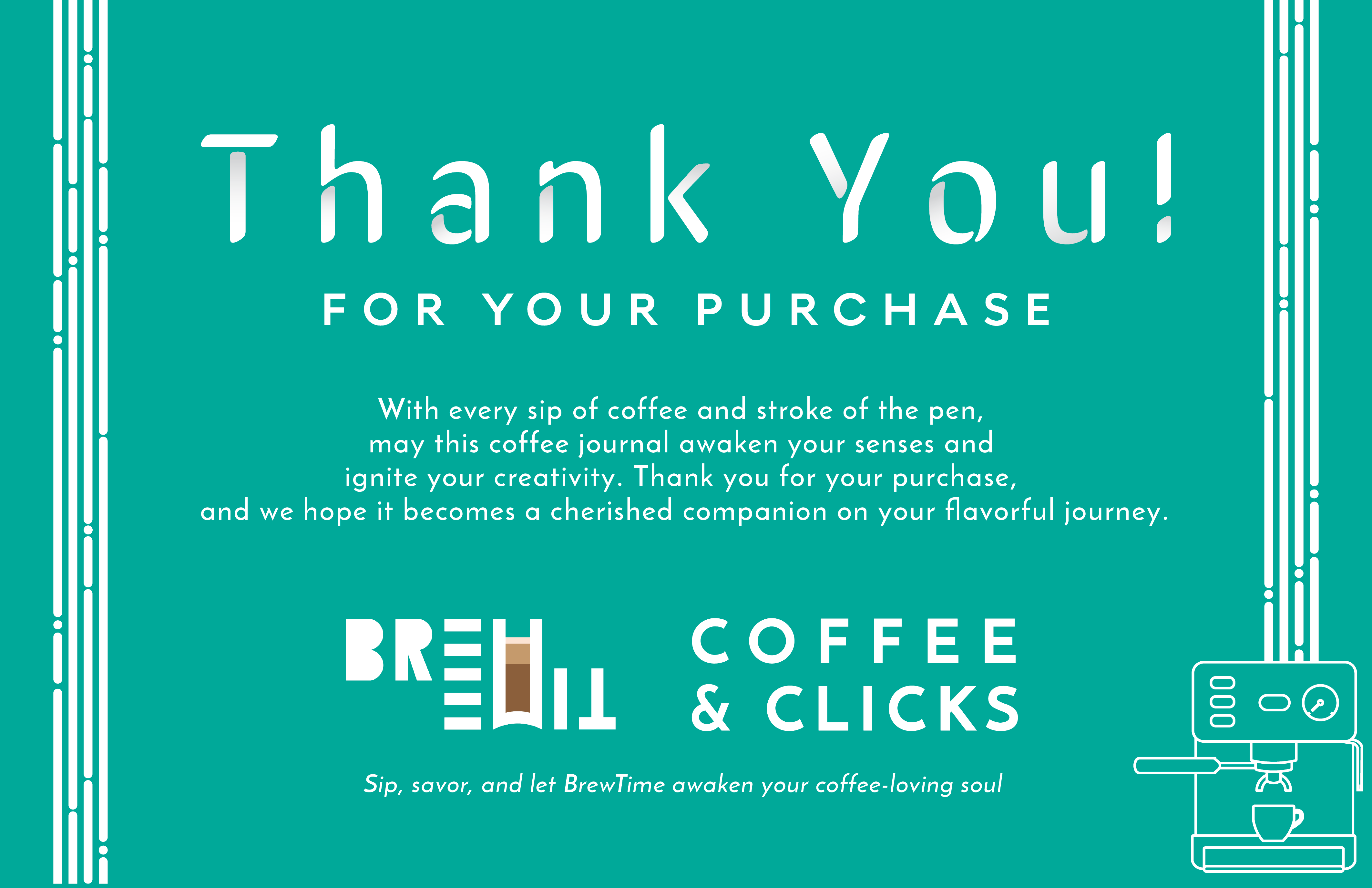
The first phase focused on creating custom artwork for the coffee journal cover and a thank-you card that was bundled with every journal. The goals being:

Differentiate the journals with intentional, coffee-focused artwork.

Create a thank-you card that adds a personal touch to every order.

Build a simple, functional website on Wix to introduce Brew Time.

Share the brand's story: from a hobby among friends to precision coffee accessories.

Provide a basic way for people to discover and order products.
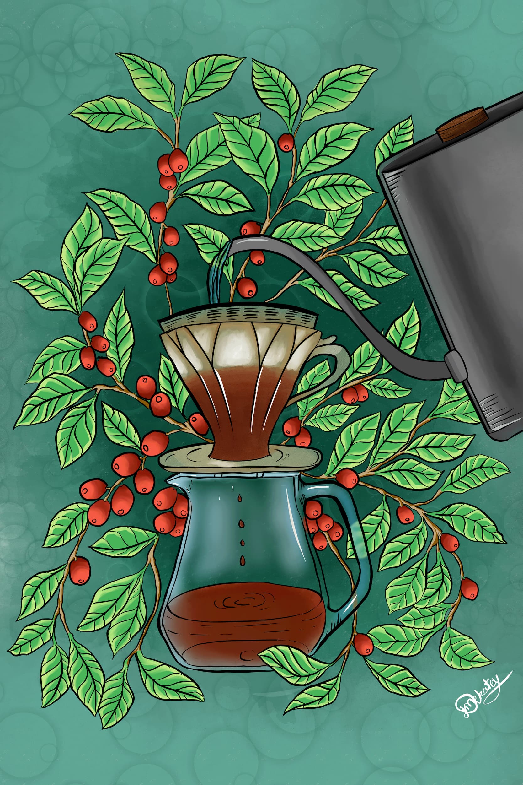
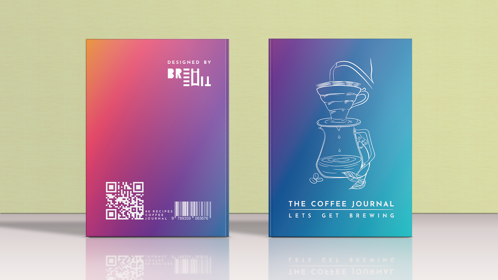
A High Quality Custom Illustration
A Thank You card for Journal Purchase
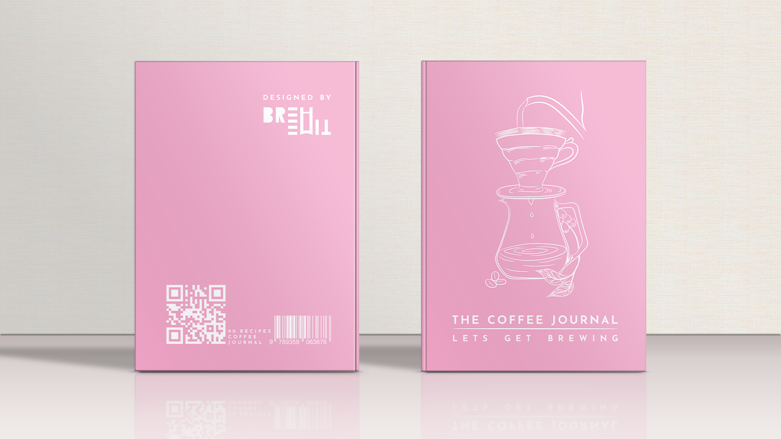
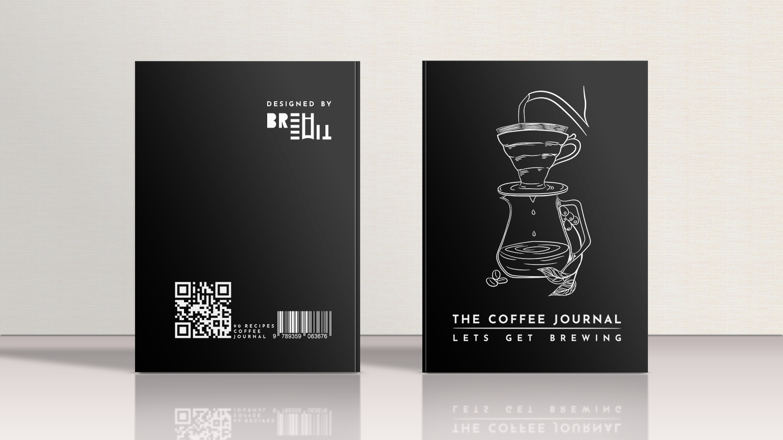
Journal variations
Journal variations
Journal variations
Journal variations
Coffee Journal Variations

Product Expansion & Packaging Redesign

As the product line grew, the focus shifted to turning individual products into a coherent range.Multiple iterations of journals were created for different brewing methods, such as espresso and pour- over, with custom artwork designed for the journal covers.The journal design was iterated across a few versions to improve usability and look.

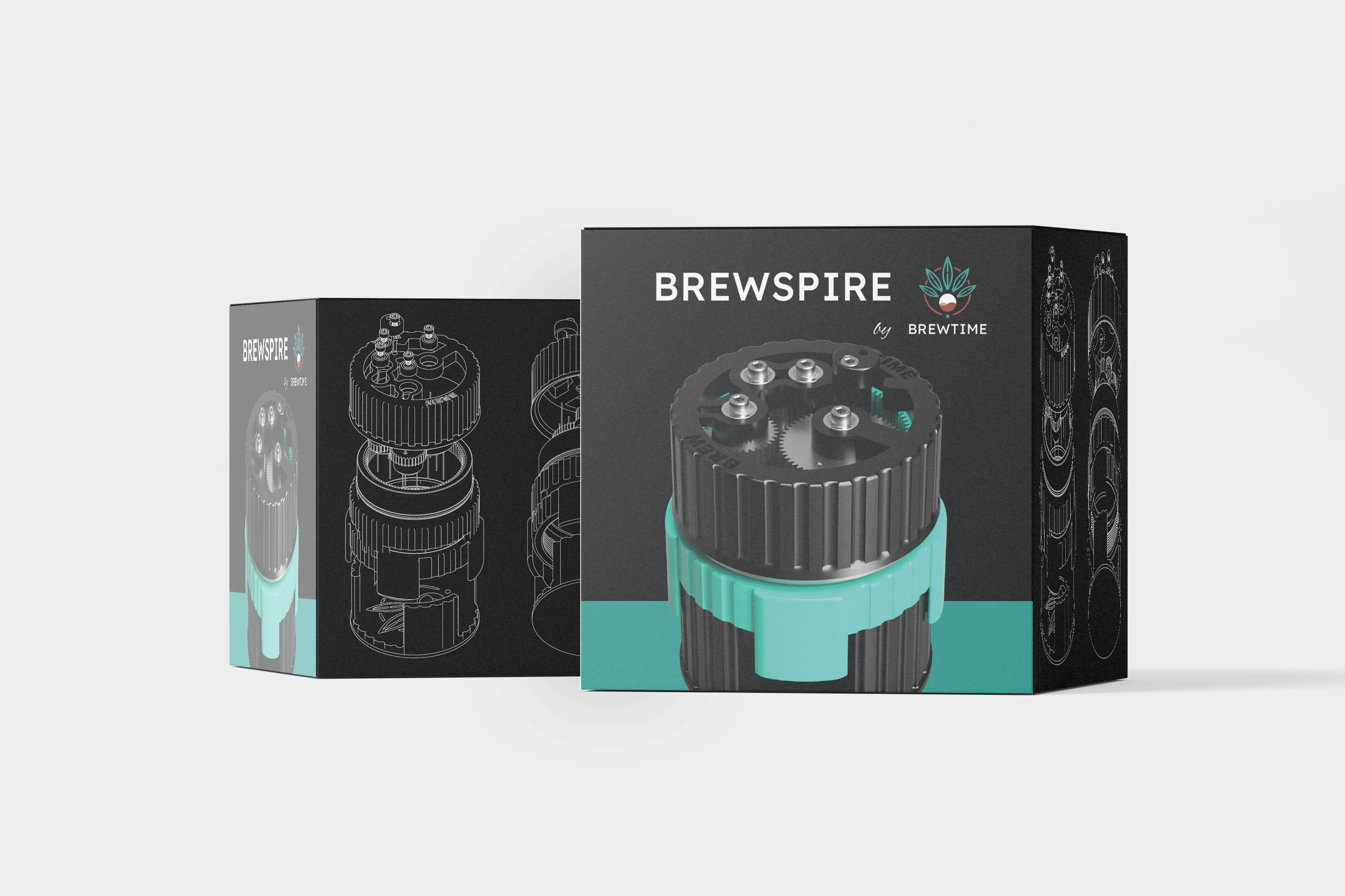
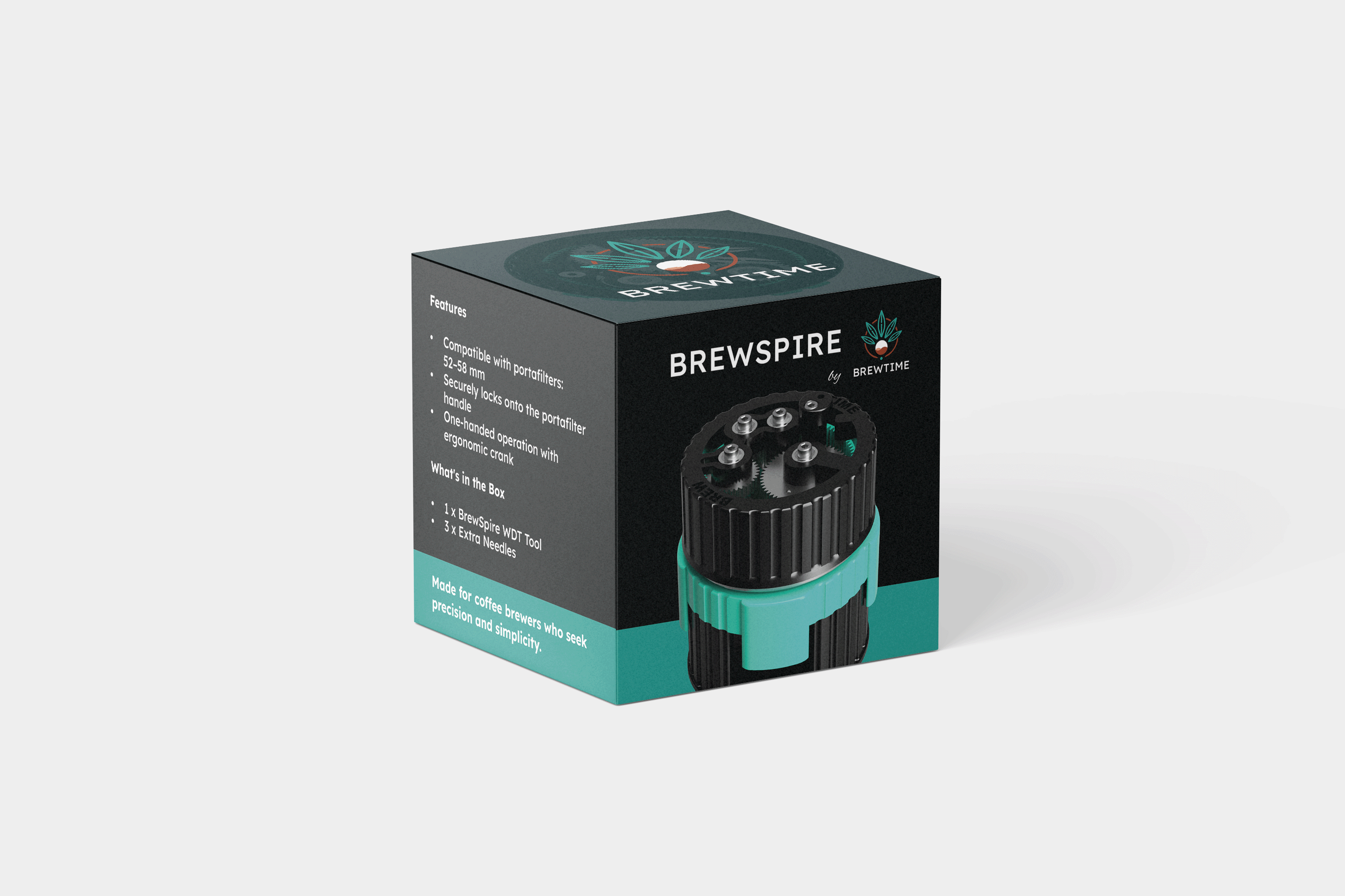
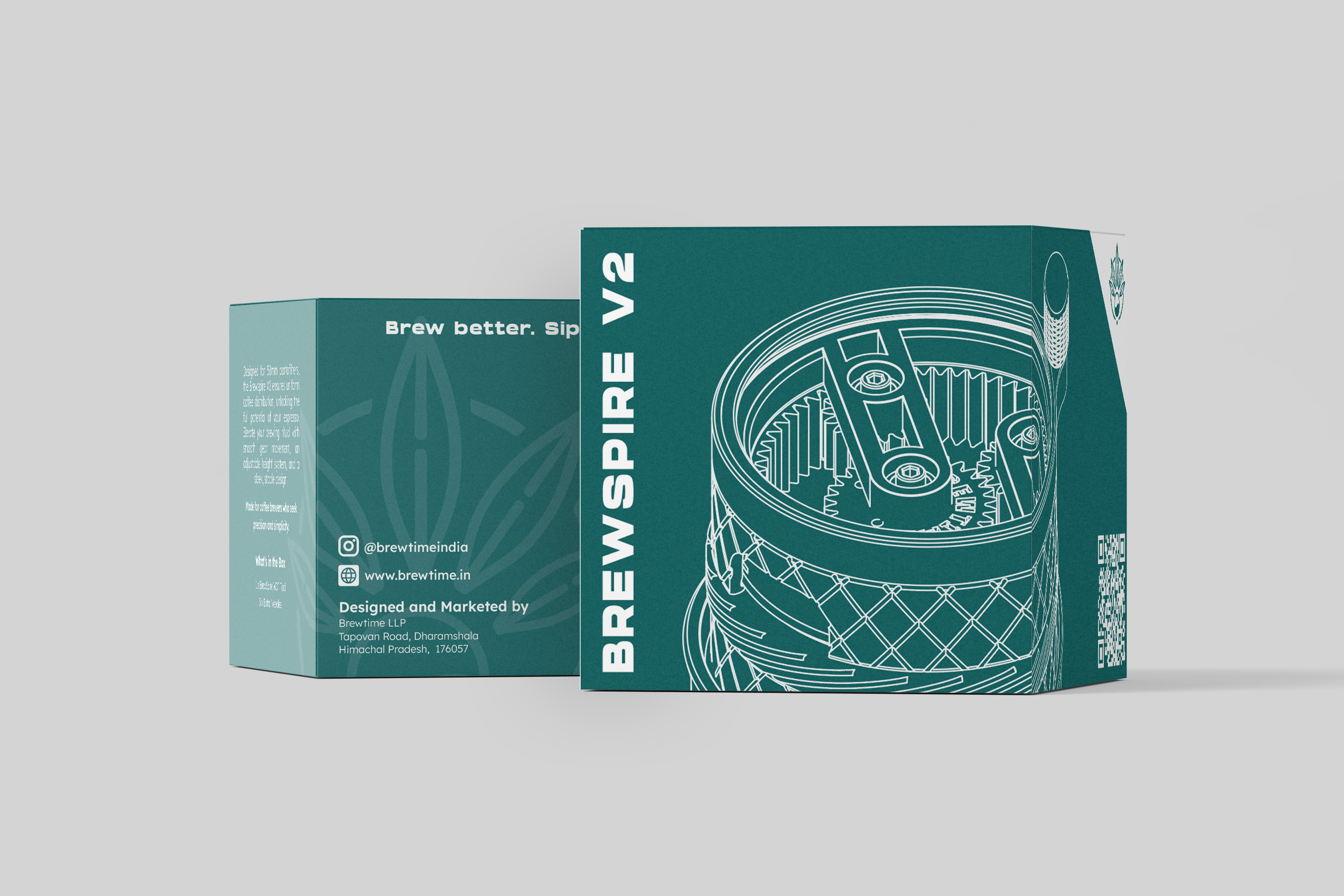
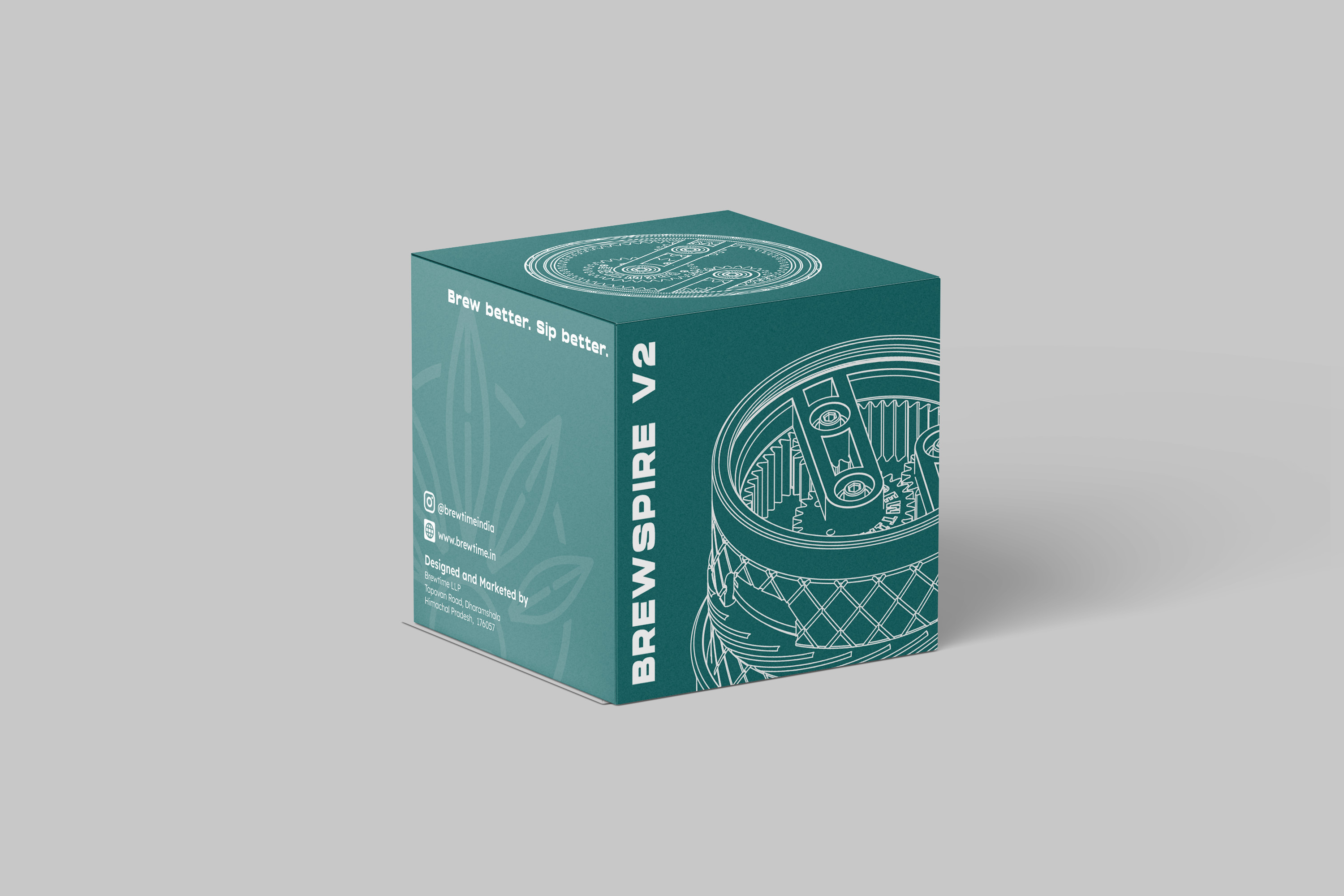
Dosing trays were expanded as a natural next product, with the visual language kept consistent with the journals. A WDT tool was developed that works across a variety of espresso basket sizes, and the product box was redesigned to match the brand's evolving identity. The packaging felt precise and speciality-focused without being cold. Each product kept the same core visual language while still having its own identity.

Old WDT packaging
Old WDT packaging
Old WDT Front side packaging
New WDT Packaging
New WDT Packaging
New WDT Front side packaging

Website Redesign

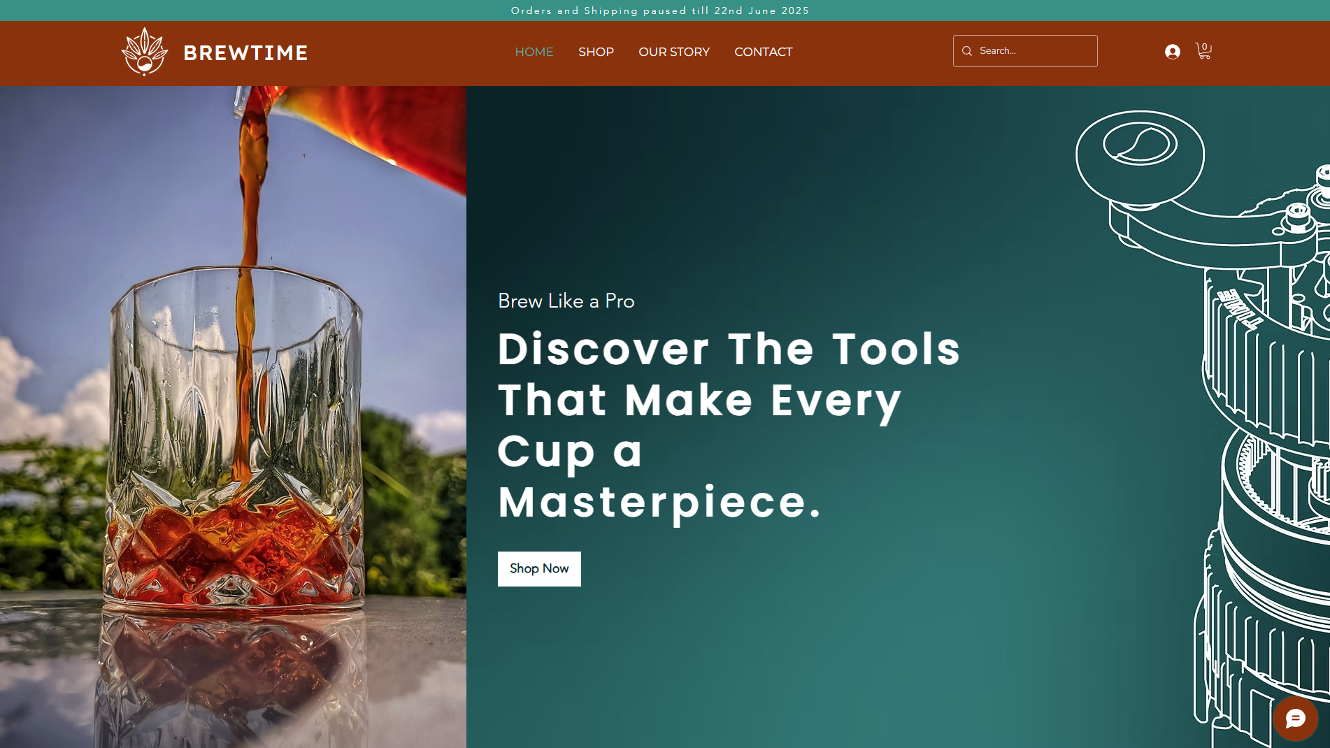
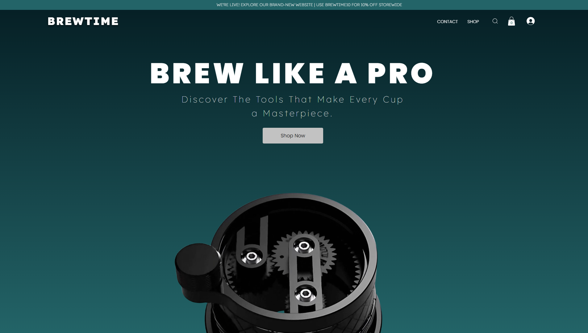
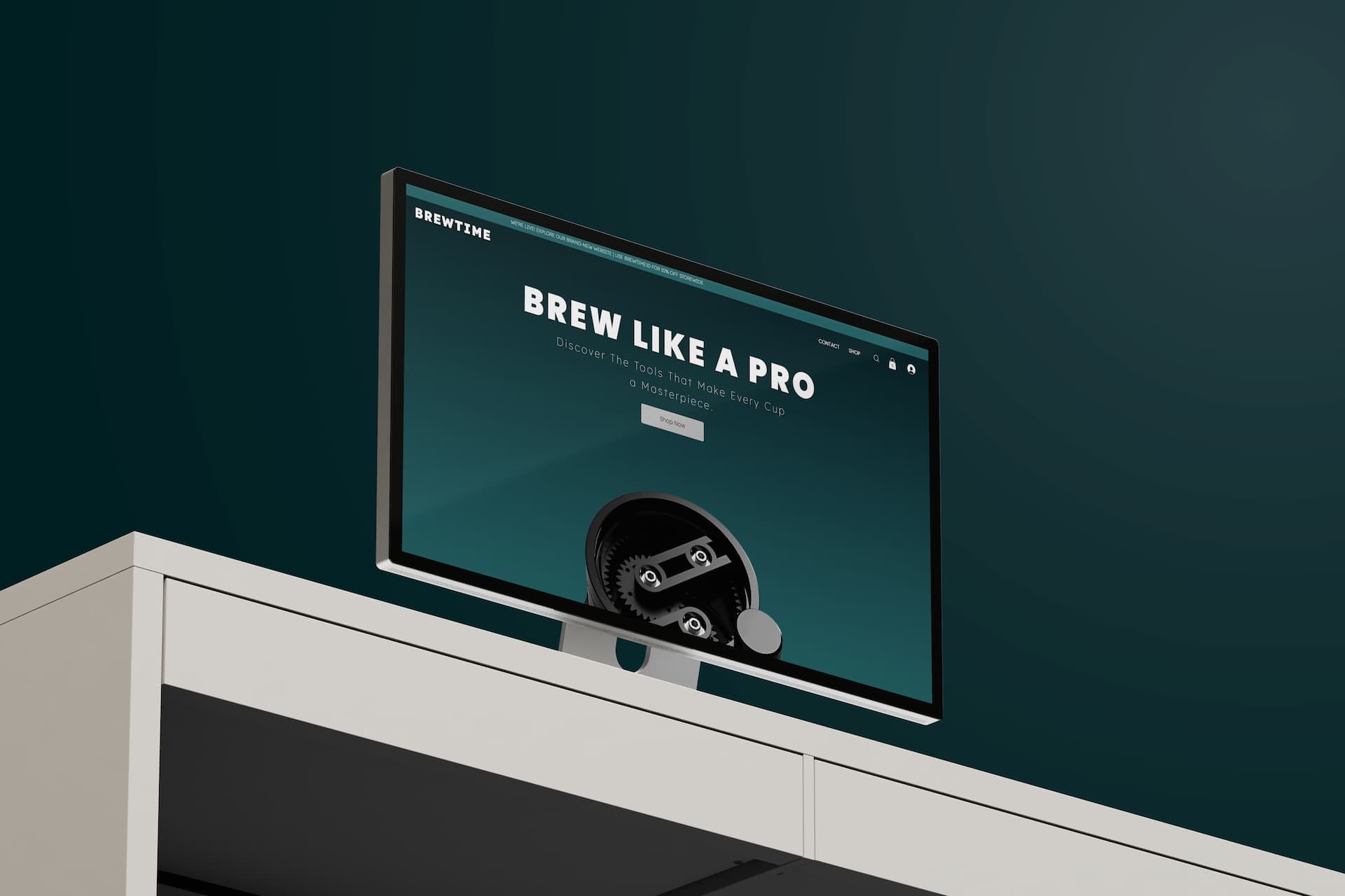
The Original Website on Wix builder has various technical limitations and idiosyncrasies. The redesign, built on Wix Studio, aimed to:

Present the full product range clearly.

Tell the brand story more effectively.

Support a better ordering and discovery flow.

Reflect the more mature, product-focused brand.

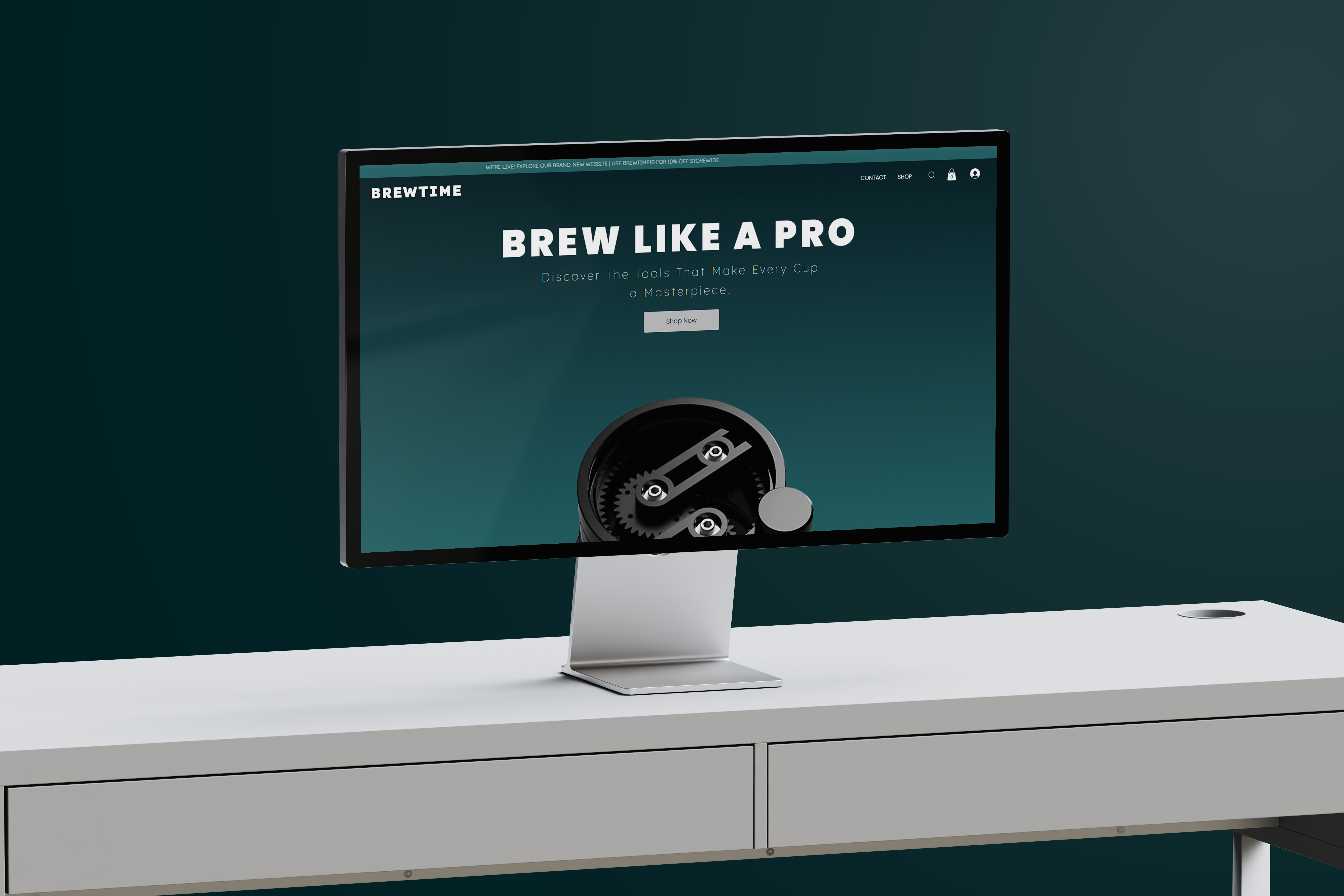
The new site used the same visual language as the packaging and products, unifying Brew Time across physical and digital touchpoints.

Old Website Homepage
New Website Homepage

What Changed

The project changed more than just how Brew Time looked. It changed how the brand could function.

The initial journals had a stronger, more credible presentation with custom artwork and a thank-you card.

Later products fit into a clearer, more organised system.

The WDT tool became a flagship with packaging that felt professional and speciality-oriented.

The redesigned website gave the brand a proper digital place to showcase its full range.

Brew Time moved from a single-product test toward a more structured, launch-ready brand presence.

Outcome

The project created a coherent foundation across packaging, product design, and e-commerce.

While the brand's rollout later paused as the founder got busy with other commitments, the system still gave Brew Time:

A clearer product family (journals, dosing trays, WDT tool, etc)

Custom artwork, thank-you cards, and packaging that felt intentional and personal.

A redesigned website that could support future growth

The value of the work was not in sales numbers, which were limited by the brand's stage and timing, but it was in the structure it created to support and scale it all.

Reflection

Brew Time is a strong example of how early-stage design can create readiness before scale.

The project moved from one product (coffee journals with a thank-you card) to a broader brand system, showing how packaging, custom artwork, and e-commerce can work together even when the business is still developing.

The most important lesson from the project is that good systems matter early. When a product is niche, founder-led, and still testing the market, design has to do more than look polished. It has to create clarity, flexibility, and a path forward.

Mockup of brewtime website

Your Brand Deserves Better than a Template.

Let us collaborate to bring your ideas to life with cutting-edge design and development that stands out in the digital landscape.

Contact us

Pixcode. 2025

Building your Vision, Pixel by Pixel.